
Shoppable Contents
Shoppable contents are the shopping module that provides immersive and seamless shopping experience in commerce centric articles for customers to discover, explore, and get inspired for shopping.
By adding an intelligent commerce module within Yahoo Lifestyle, Celebrity, Entertainment article pages, it will recommend the right fit to users from their daily content reading habits and create huge opportunity for brands to be in front of the shoppers at the right time and at the right place.
My Role
Lead Designer, worked with 2 PMs and 1 researcher. I contributed to the end-to-end flow from concept exploration, pitching of ideas to user testing.
Duration
Mar 2021 - May 2021
Set the Goals

User Journey

Visualize the Concept
From what we’ve learned, product image/ price/ deal/ title/ brand/ purchase numbers and reviews are all critical elements for a product cell. The importance vary from the user’s value to what category the product belongs to. Therefore, we prioritize them differently according to the business strategy and user preference.
Exploration and Iterations

After identify the major focus of this shoppable module in article, product info and target relevancy, we started to explore different ad formats. There are two strongest concepts that stand out after a couple rounds of discussion with the team. At this point, we wanted to know which concept would work, so we had a usability test to figure it out.

Pros:
-
Each card visually clearly delivers the information of what the product is
Cons:
-
The whole shoppable ads may take too much article space that users would like to explore by themselves

Pros:
-
Image is the key visual elements to get users’ attention
-
Always have the CTA conveys strong hint to users they can shop the items
Cons:
-
User can’t really tell what the product is from images until hovering to view the title
-
Product title in hover state blocks the adjacent images
Pros:
-
Image is the key visual elements to get users’ attention
-
Always have the CTA conveys strong hint to users they can shop the items
Key Findings
1.
The location of the ad is important
"I didn't expect to see the ads straightaway, it comes too soon. I'd prefer to see it after I've started read some of the article."
2.
Participants preferred to see more product information without hovering
"It's nice to include the name, price directly on it instead of having to put your mouse over it."
" Would be nicer to see more information than just the name and price before deciding whether to purchase."
3.
Users like to see “Shop now” button on all the items.
"Clicking on the CTA takes me to the shopping website, this is what I expected to happen. I felt more invited to click on these items."
Design Directions
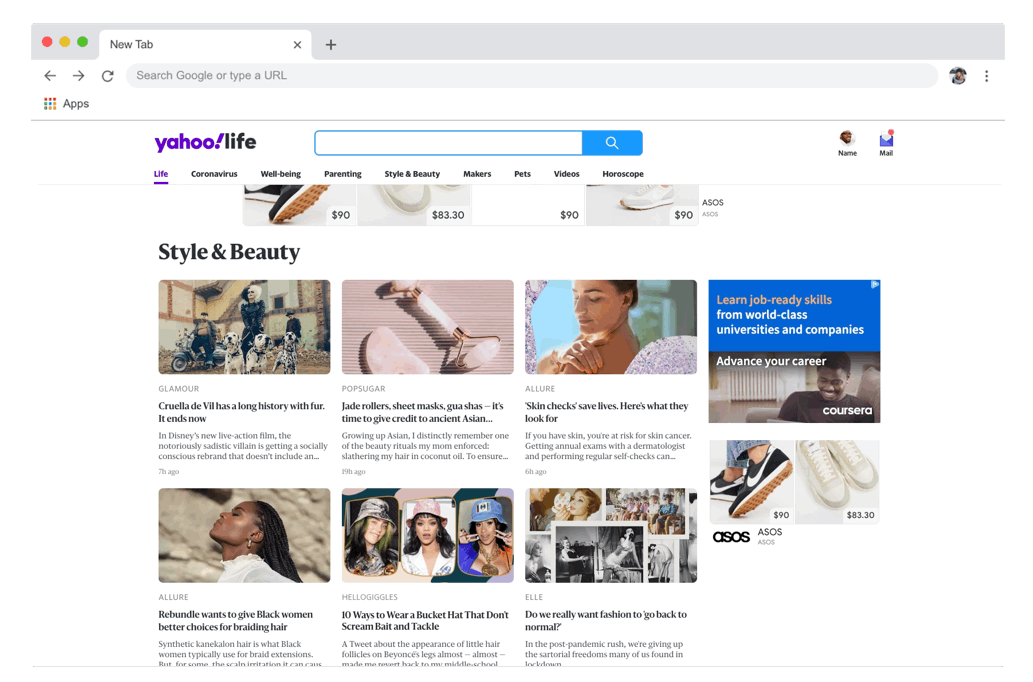
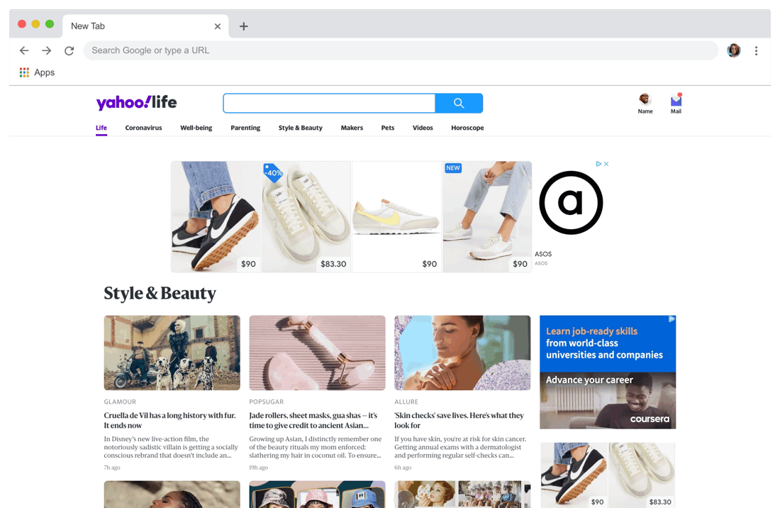
After user testing and discussion with the content team, we decided to locate the ad after the first paragraph of the article. Users will an overview of the shopping module, they can view more product details by expanding the module. The product images, price, deals, brand name can help them make informed purchase decisions.
Option1


By default the commerce module will be in collapsed view, with four product thumbnail images and view more button to expand to full module view.
Option2


With larger thumbnail ad images and the borderline treatment, the shopping ad module is easier to be noticed when user is reading the content.
Results
We took both options into a 10% bucket testing on Yahoo article page, each test has around 365k users, the total revenue of shopping module and editorial curated commerce module increased 5%.